Content & Design
- Email Headers and Footers
- Email Templates
- Translations
- User Portal Branding and Setup
- Pages and Content Blocks
- Templates and Design
- Form 11 Shortcodes
- User Information Shortcodes
Email Headers and Footers
Email Headers and Footers in OPSCOM allow administrators to define and manage reusable layout components for system-generated emails. By customizing these elements, you can ensure consistent branding, provide essential contact information, and apply uniform styling across all your automated email communications, creating a professional and cohesive user experience.
Using this Feature
Email Headers & Footers are managed through a dedicated section within System Configuration.
- Hover over System Configuration, then Contents & Design, and click Email Headers & Footers.
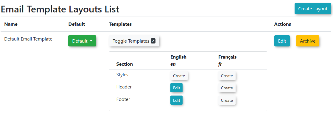
The Email Template Layout List page displays the various sections of your email layouts (e.g., Header, Footer, Style). From here, you can select and edit the individual components that make up your email layouts.
Editing Email Layout Templates
- Click Toggle Templates. Locate the corresponding Section you wish to edit (e.g., "Header" "Footer" or "Style").
- Click the Edit button for that section.
- Within the editor, you can:
- Add or modify text.
- Insert images (e.g., your organization's logo).
- Include inline styles directly within the HTML to control appearance (e.g., colors, fonts, spacing).
- Click Save Changes. You will see a message that your changes have been saved.
- You can also archive your template by clicking the Archive Template button in the Top Right.
- Click the Back button to edit other sections.
Best Practices & Considerations
- Consistent Branding: Use email headers and footers to consistently display your organization's logo, branding colors, and contact information across all automated emails.
- Essential Information: Ensure your footer contains crucial information such as your organization's name, website, and a general contact email or phone number.
- Mobile Responsiveness: When adding content and styling, consider how your headers and footers will appear on mobile devices. Use responsive design principles or simple layouts for best compatibility.
- Inline Styling: While the editor allows inline styles, for more complex or sitewide styling changes, coordinating with OPSCOM Support for custom CSS in the "Style" template might be beneficial.
- Testing Changes: After making any modifications to headers, footers, or styles, always test the email templates that use these layouts. Send a test email to yourself to ensure everything renders correctly in various email clients.
- Global Impact: Remember that changes made to these layout templates will affect all email templates that are configured to use them.
Email Templates
Email Templates in OPSCOM allow administrators to customize the content and appearance of automated emails sent by the system. By leveraging available shortcodes and a smart editor, you can create dynamic, informative, and engaging messages for various notifications, ensuring clear and consistent communication with users.
Using this Feature
To access and manage your default email templates:
- Hover over System Configuration, then Contents & Design, and click Email Templates.
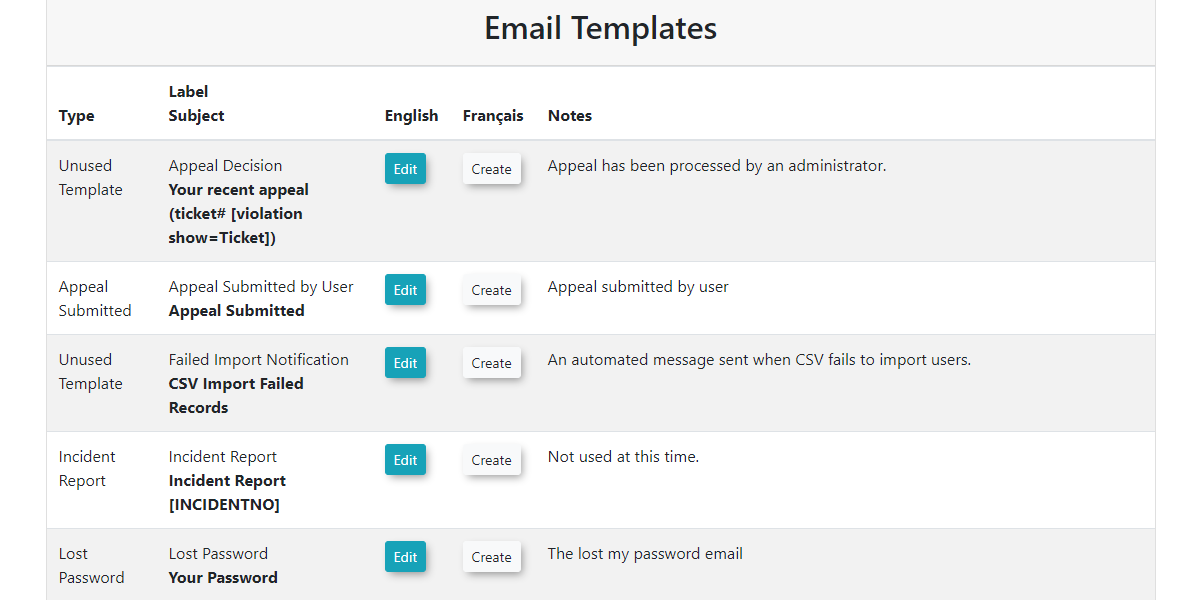
- All the default email templates available in the system will be displayed.
The Email Templates interface allows you to edit existing templates, utilize dynamic shortcodes, and configure various fields to tailor your messages.
Editing Default Email Templates
- Locate the template you wish to edit in the list.
- Click the Edit button next to it.
- You will be taken to a dedicated editor interface where you can make changes to the email template.
Creating Templates for Other Languages
If you have other languages installed, you can click the Create button to create templates for these languages.
Email Template Fields - What do they do?
When editing an email template, you will configure the following fields:
- Label: This field is how you will identify your email template within the system's list.
- Type: This is a non-adjustable value that indicates the specific purpose or trigger for this email template (e.g., "Appeal Submitted," "Password Reset").
- Language: This field contains options to select the language for the template, typically supporting options like French or English.
- Layout: This allows you to select a pre-defined layout that surrounds your message. Layouts include your email header, footer, and overall styling. You can create or adjust email template layouts under System Configuration, then Contents & Design, and click Email Headers & Footers.
- Subject: This is the text that will appear as the subject line of the email message.
- HTML Content: Here you will write the main body of the message. This section supports rich text formatting, the insertion of images, and the use of shortcodes to create visually appealing and dynamic emails.
- Text Content: This section is a simple text editor for the message itself. It does not support shortcodes or any formatting. This plain text version is often used as a fallback for email clients that do not render HTML.
Using Shortcodes
Each email template has a set of available shortcodes that you can use to dynamically insert specific information into your message.
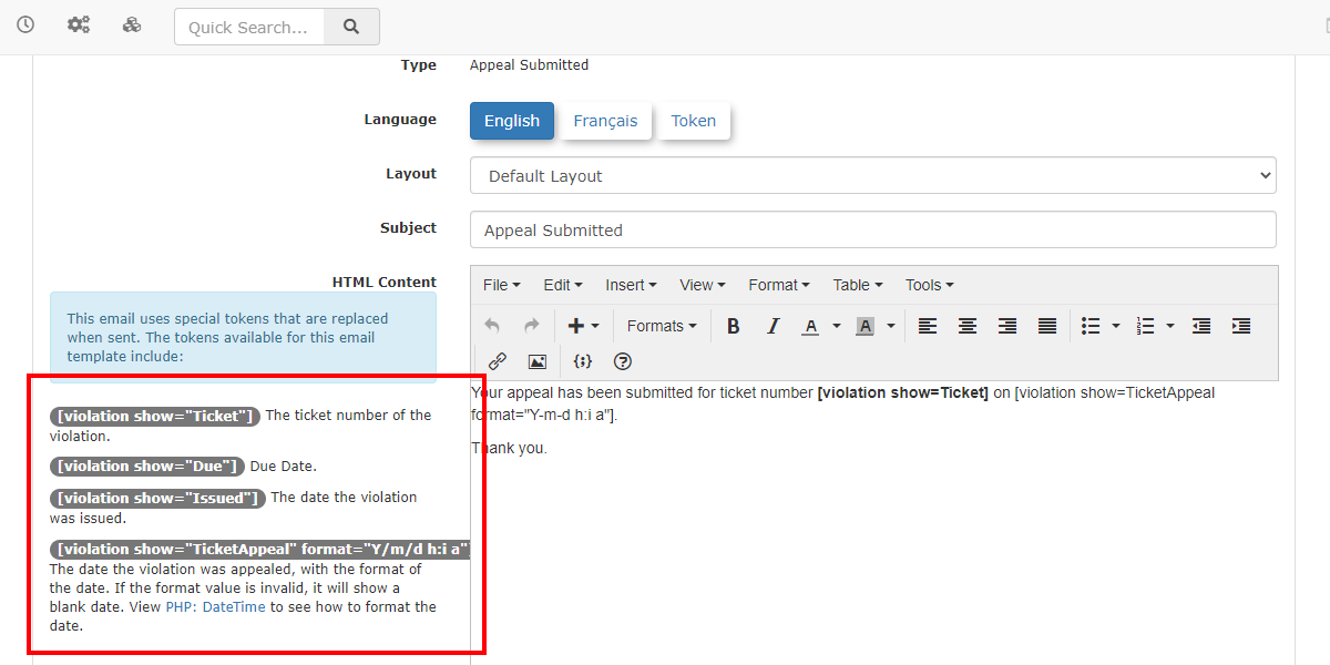
- The shortcode tokens are typically displayed on the left side of the template editor.
- For example, the email template for "Appeal Submitted by User" might offer shortcodes to automatically include details like
[ticket_appealed_date]or[ticket_number], allowing you to craft messages without manually knowing these specifics. - You can insert these shortcodes into the smart editor on the right side. The system will automatically replace the shortcode with the appropriate information when the email is sent to the desired user.
- The smart editor also provides formatting capabilities, allowing you to add images, format text, and arrange your messages much like a word processor.
Best Practices & Considerations
- Utilize Shortcodes Fully: Maximize the use of available shortcodes to make your emails dynamic, personalized, and informative, reducing manual effort and potential errors.
- Consistent Branding: Use email layouts (Email Headers & Footers) to maintain consistent branding (logos, colors, contact info) across all your system-generated emails.
- Clear Subject Lines: Craft clear and concise subject lines so users can immediately understand the purpose of the email.
- Review Both HTML and Text Content: Always ensure both the HTML Content and Text Content sections are populated and convey the message clearly. This provides compatibility for all email clients.
- Test Templates: After making changes to an email template, send a test email to yourself or a test account to verify that all shortcodes are rendering correctly, formatting is as expected, and the message is clear.
- Language-Specific Templates: If your system supports multiple languages, ensure you create and maintain separate templates for each language.
Translations
Where are Translations Supported
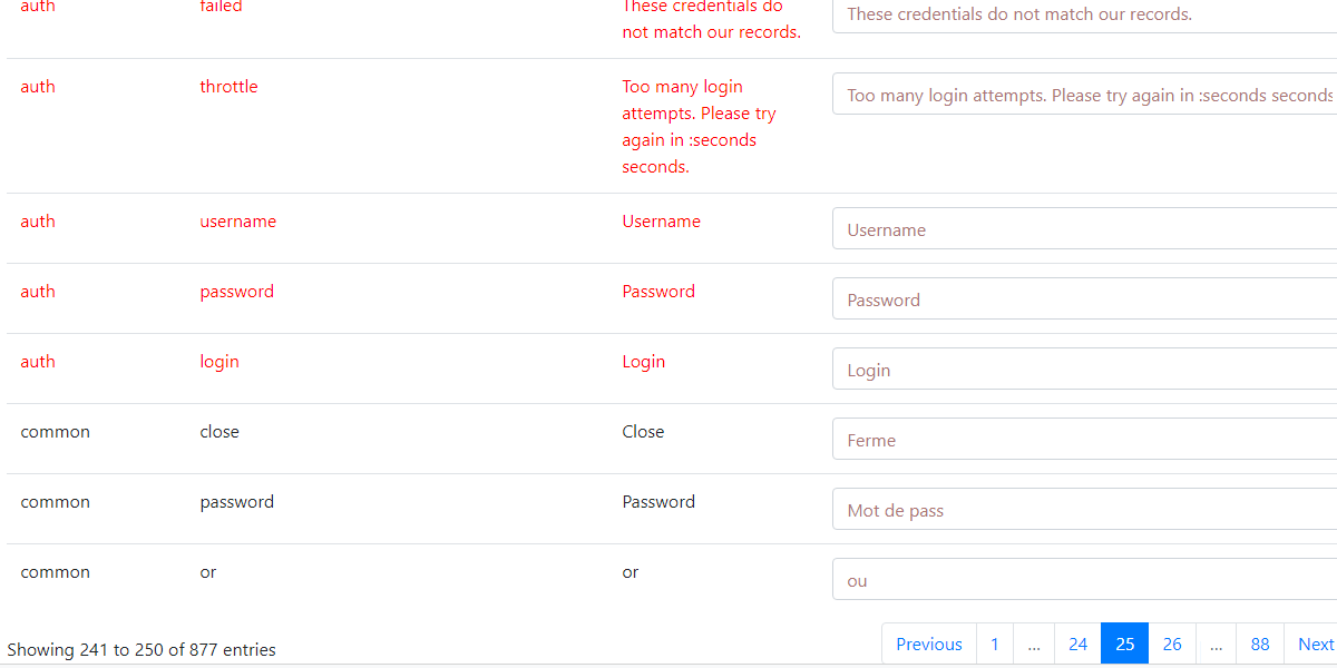
Currently, translations are only supported on the user side, however, they are managed and set up on the admin side, by admins that have the correct permissions set up to work with languages.
- Translations that are in red, are translations on the adminside which are not yet supported. Since they are not supported you will see them come up in English only until the adminside is supported.
- Translation that are in black, are translations that are on the userside that can currently be changed.
Navigating to Translations
To begin reviewing, editing or creating your translations/languages, you will need to navigate to System Config → Content & Designs → Translations.
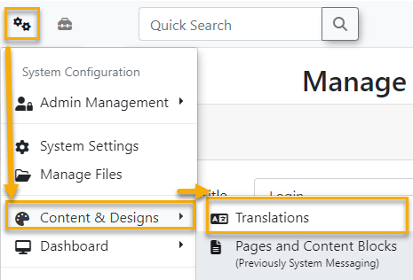
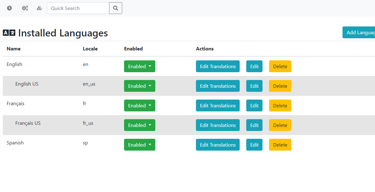
This will take you to the Installed Languages page where you can begin managing your current languages.
Adding New Languages
To begin adding your own languages simply click Add Language on the Installed Languages page which will bring up a new modal to add a label and locale.
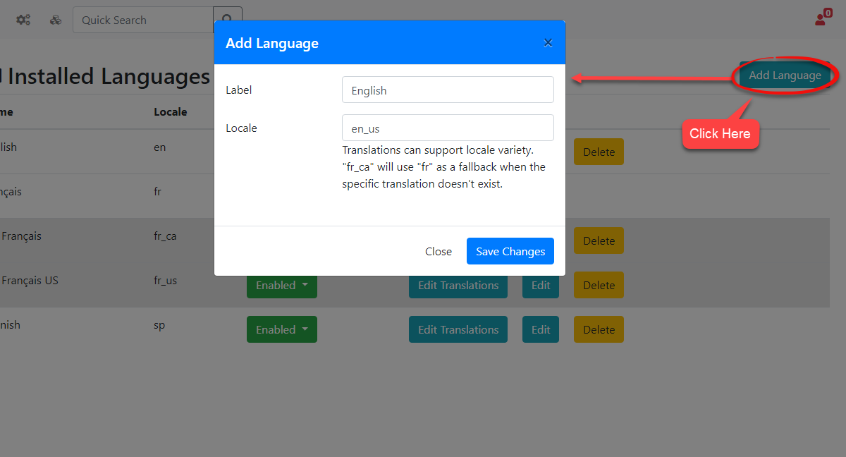
When you are finished click Save Changes and your new language will be instantly added to the list. Once the language has been added, your users can begin using it on the user-side assuming you have the language enabled.
The locales are used when we want to create sub-languages, while the label is used to identify our translations throughout the site.
Adding Sub Languages and How do They Work
Sub-languages are created by using a locale that currently exists with an underscore '_' followed by the sub-language that you want to set up.
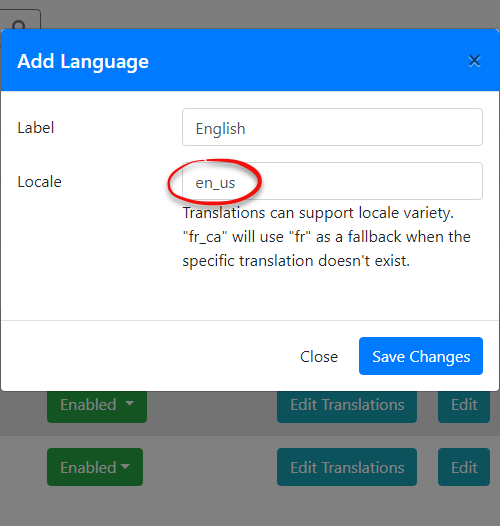
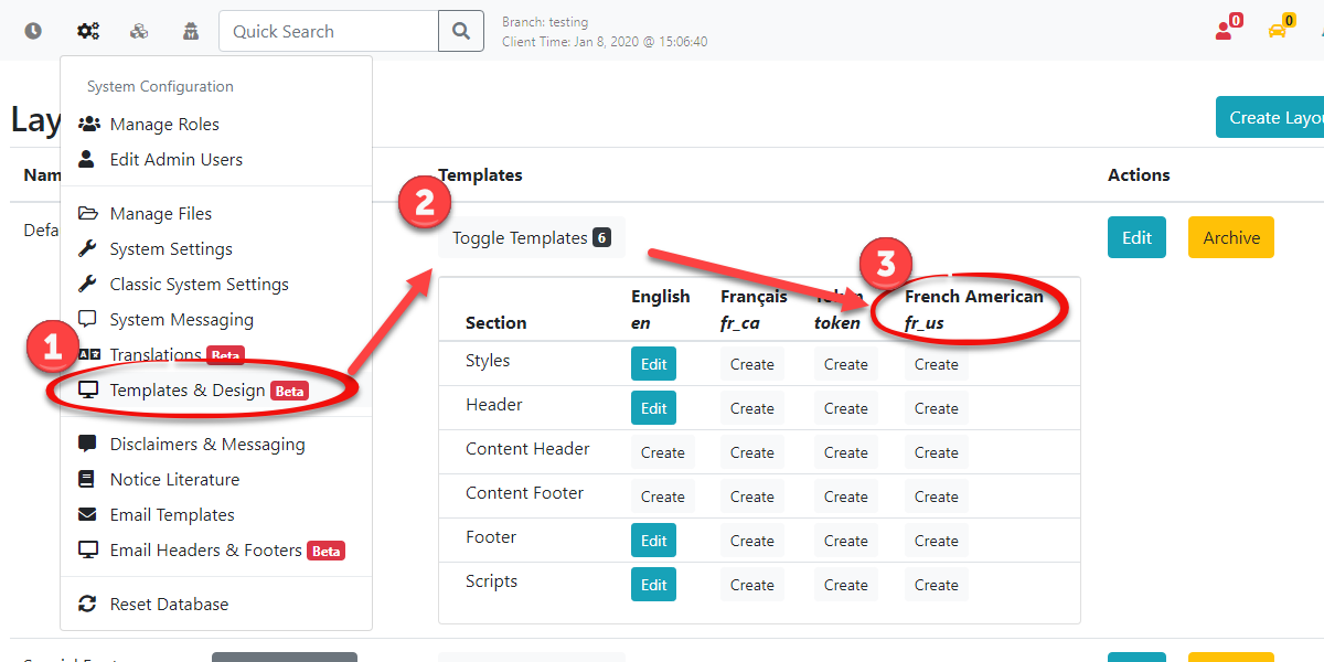
For example, you can support multiple variations of the English language for your users. In the image below I have created a sub-language for American English using the locale en_us.
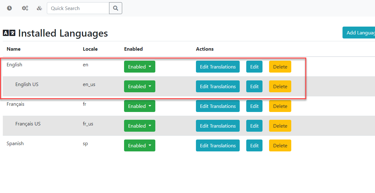
When you create a new sub-language, it will automatically use the translations that have been set up on the main language, which is the locale on the left side of the underscore, such as en_us. You will need to create the main language first before creating any sub-languages, otherwise the sub-language will always default to English instead of the main language you may have intended to use.
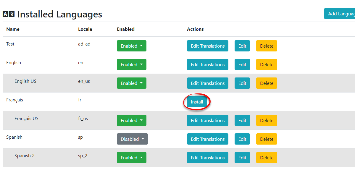
Installing Languages
Installing a language will create a new language template with the translations we have set up for it as well as the Name and Locale we have created for you. You can then click Edit Translations to adjust the preset translations to your liking. If there is not a language already in the system that can be installed you will need to add a new language and setup the translations yourself. Currently, we only support the ability to install French and English.
Disabling or Enabling Translations
We can choose to disable particular languages that we don't want to be selectable from the user side. To do this we can toggle the visibly of our languages under the Enabled column on the Installed Languages Page.
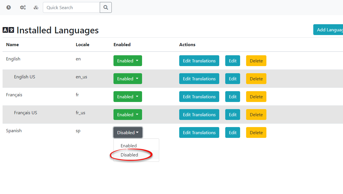
Once a language is toggled as Disabled it can no longer be selected by the users of your site as seen in the example image below.
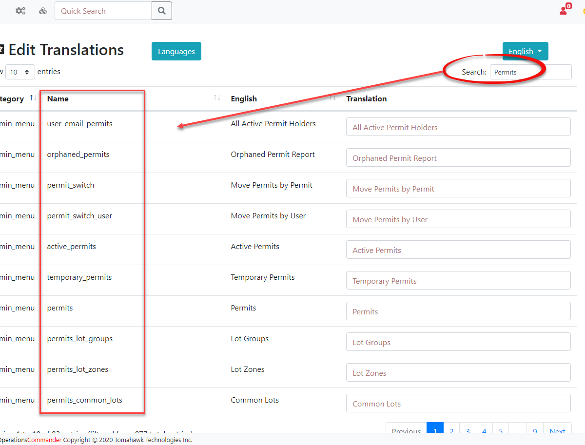
Searching Language Translations
You can search for all translations that relate to a specific component in the system using the search bar at the top right of the Edit Translations page. For example, we can search for permits to find all permit related translations.
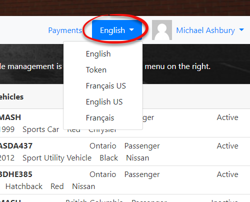
We can also go onto the user side and use the Token language, which will show all of the Names found on the Edit Translations page, under the Name column, (See the image above) to find where that translation exists so it can be changed. This can't be seen by logging is as the user from the user side but requires an admin to go to the profile of a user and click the Login as User button from the admin side. This is to ensure that your regular users don't see the token language option.
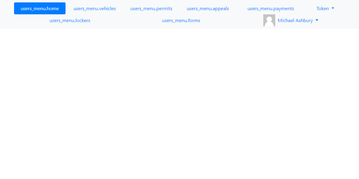
The token language finds the tokens used so you can better search where the translations are being used on the user side.
Edit Translations
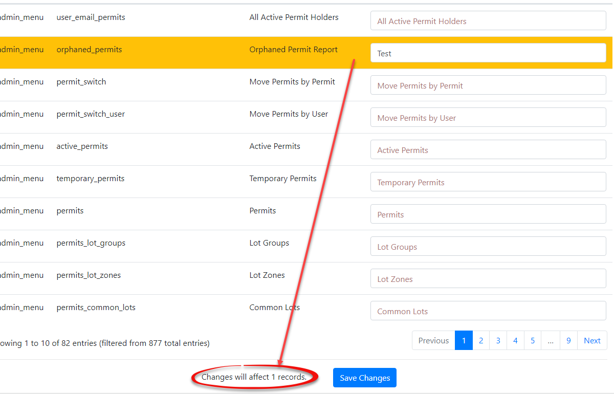
To begin editing language translations you have to make your changes and then click away from the input field. Once you do this you will see that the translation gets highlighted in yellow indicating that a change has been made. The number of affected records will also display at the bottom of the translations page.
When you are finished making your changes click Save Changes for the update to take effect.
Delete Languages
To delete languages, you can click the delete button next to the language you want to remove. Keep in mind that if you remove the base English and French language it can be re-installed. However, if you delete a language that we do not provide you, then this data will be lost and you will need to contact support for assistance with recovering these translations.
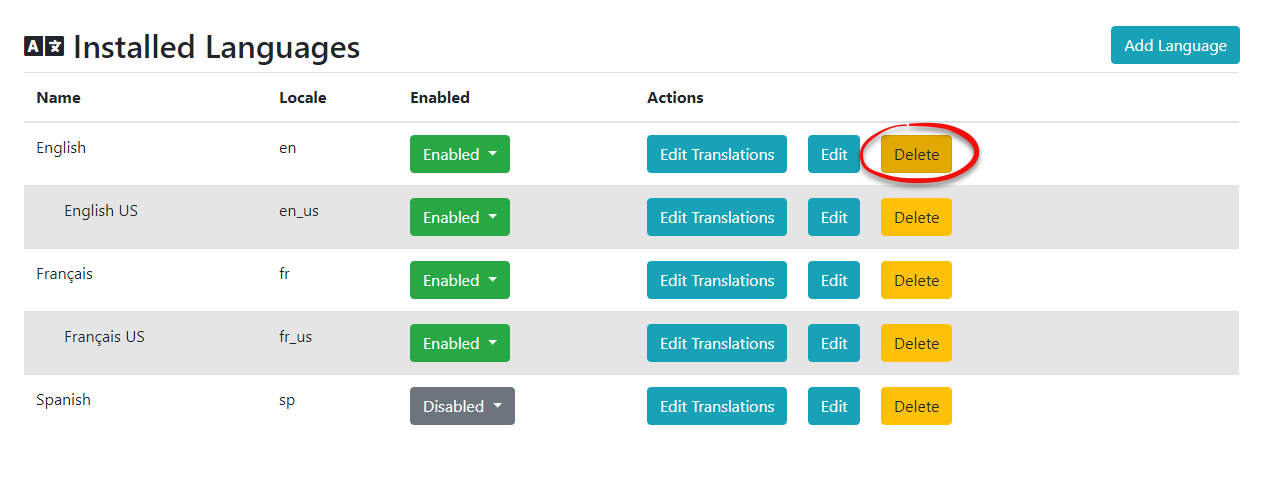
Keep in mind that deleting a language will not delete any of the sub-languages you may have created. For example, if I were to delete English, the English US language would still remain with all of its translations.
Creating Templates and Messaging for New Languages
It's important to note that when you create a new language it will not rely on the default templates and system messaging that you have setup for your previous languages. For example, if I use the new French American language I created, and go onto the user side where languages are supported, then I will see a blank template as well as blank messages.
Adding Templates
To add a new template for your languages that you create you will need to go into Templates & Design followed by Toggle Templates for the templates that are currently being used. From there you will have the option to click the Create button to add the new template. If you just want your new language to use the same template, from a language that is already in the system, just go into Edit and copy the text over into your new language, after clicking the Create button.
Adding System Messages
System messaging will work a bit differently than templates as you will need to go into each individual message and click the Edit button next to that message.
From there you should be able to select your new language.
If you want multiple messages to display for all your languages you will need to create a new system message and type out the translations for that language template.
Changing Terminology Using the Translator
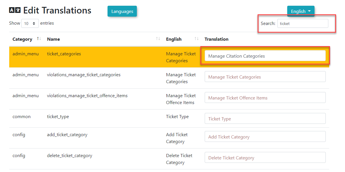
There is another use for the translation tool that may not be obvious at first. Since the translator is essentially a list of code terms and a corresponding list of what is actually displayed on any page not only can you edit the various languages but for each language you can also edit the display term to fit a local "version" of the term. A perfect example of this is in some areas one might refer to receiving a "ticket" as receiving a "citation". It is entirely possible to replace any spot in the interface where the term ticket is used with the term citation.
To do so go into the language editor and search for the term you wish to localize. In our example simply enter ticket in the search bar and hit return. A list of all translatable instances of the word ticket will appear. Click the box where the term is editable and type in your preferred term. In this case we are changing Manage Ticket Categories to Manage Citation Categories. Once you save the changes you have made the displayed text associated with Manage Ticket Categories will display as Manage Citation Categories throughout the system. You may edit the remaining instances of the word Ticket that are in the list before saving to change the term in bulk for all entries listed.
User Portal Branding and Setup
OPSCOM administrators can define global default branding for the User Portal. By configuring the Default Site Logo and Default Site Header, you can ensure consistent branding and visual presentation across your OPSCOM User environment.
Setup & Configuration
Default images are configured within the Global component of the System Settings.
- Hover over System Configuration, and click System Settings.
- Click the Global settings tab. Within the Global Setting section, you will find two key areas where you can configure images:
- Default Site Logo
- Default Site Header
Setting the Default Logo
- Next to the Default Site Logo setting, click on Select Image.
- You will be taken to the Manage Files section (your file repository).
- Browse your computer or search for the image you wish to use as your default site logo.
- Select the desired image.
Setting the Default Header Image
- Similarly, next to the Default Site Header setting, click on Select Image.
- Follow steps 3-4 above.
Once the images are selected, their file names or previews will appear in the respective configuration settings fields. Remember to Save Settings to apply these selections.
Observing the Changes
These default images serve as fallbacks and will appear in various places throughout the OPSCOM system if no specific logo or header is set in other areas (such as the Contents and Designs section).
Common places where these default images are utilized include:
- The User Portal (e.g., your public-facing permit purchasing site).
- The phone interface utilized in features like Real-Time Parking.
- Mobile apps, Text2ParkMe, and QR code interfaces
Best Practices & Considerations
- Branding Consistency: Use high-quality, appropriately sized images that reflect your organization's branding for both the logo and header.
- Optimization: Ensure image files are optimized for web use (e.g., compressed, appropriate resolution) to ensure fast loading times on all interfaces.
- Global Impact: Remember that these are default settings. If you have specific headers or logos configured in other sections of the system (like individual email templates or specific public pages), those specific configurations will override these global defaults.
- Accessibility: Consider the visual accessibility of your chosen images, especially for text overlays or contrast, if applicable to your header design.
Pages and Content Blocks
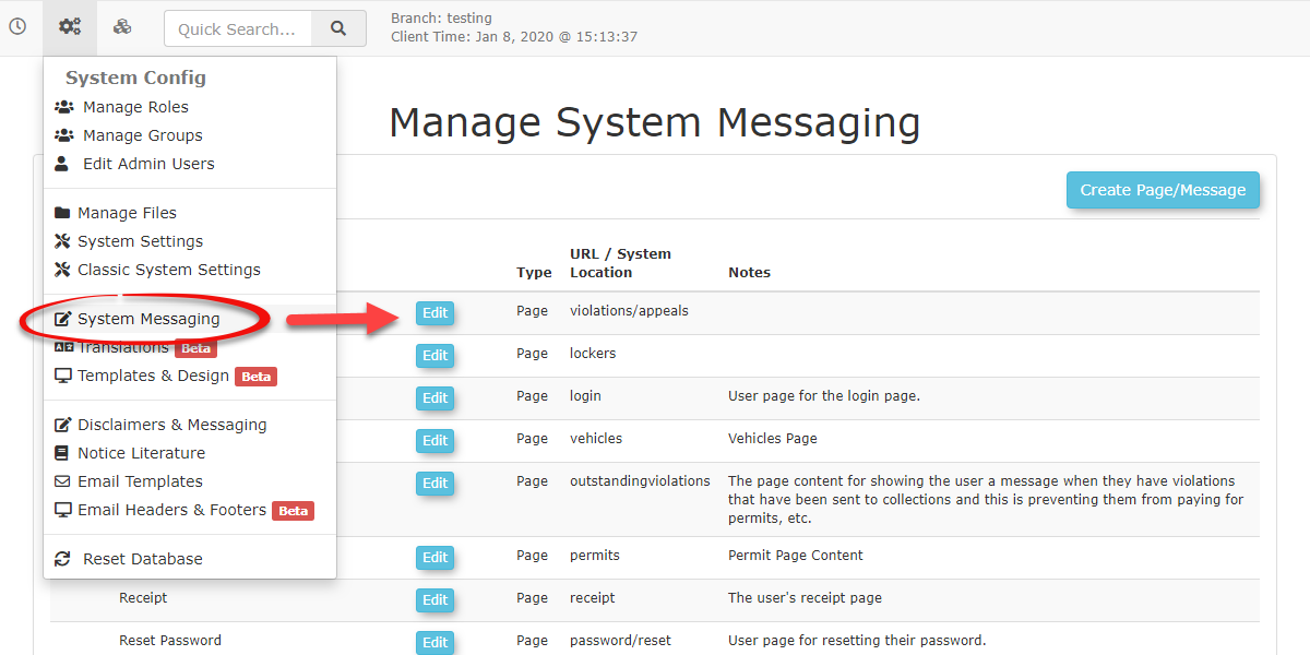
Accessing System Messaging
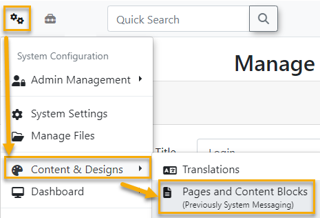
To access and manage your System Messaging navigate to the gears icon  and click on Content & Designs -> Pages and Content Blocks.
Creating Pages
We also provide a video to visually demonstrate how to use system messaging https://drive.google.com/file/d/1DU3qorWnAp_2N9mcNGFYTttNHMeRpXsQ/view
Pages display the visual content found throughout your application. You can edit the contents of your page or post a System Message by using the Disclaimer Shortcode on the Page you want it to show up on. Shortcodes also make it convenient to add interactive content to your pages. For more information on Shortcodes scroll to the bottom of this page.
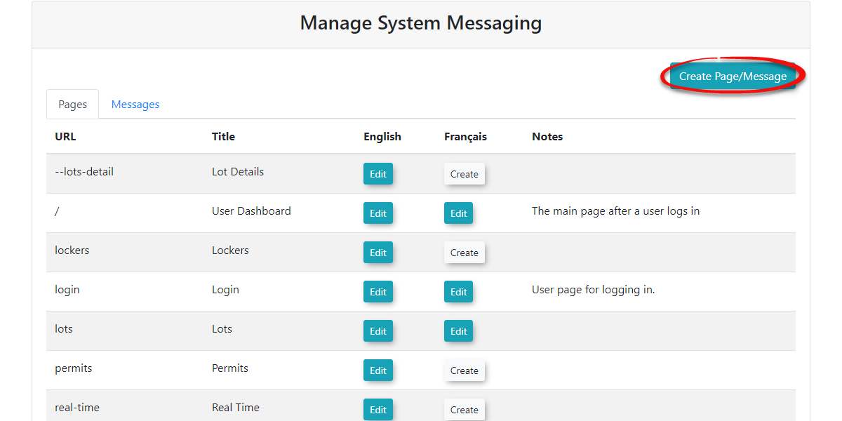
- To create a Page click the Create Page/Message button at the top right of the Manage System Messaging screen. It doesn't matter what tab you're on when you do this as you will specify the Page Type when you go to create the page.
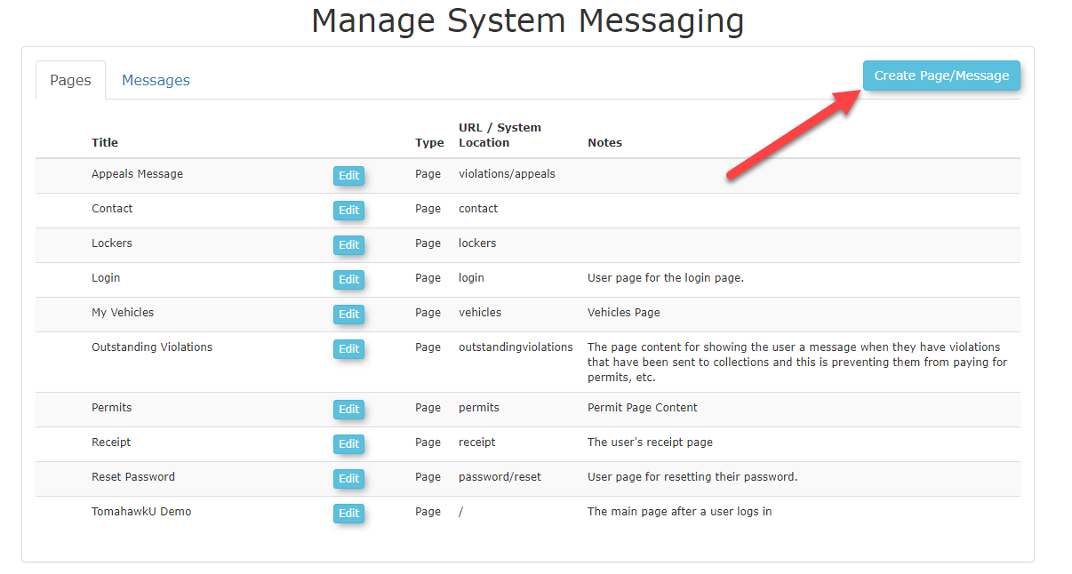
- Once you click this button OPSCOM will take you to a different section where you can set the properties and content of the page. Below is a detailed description of the options available to you when creating new Pages.
| Page Attributes | Short Description |
|---|---|
| Title | The Title of the page you wish to create, which will be the name displayed on the user navigation bar. |
| Path |
The path after the domain. i.e. login/ → This is the home page Changing this to lockers/area/1 will display login/lockers/area/1 as the URL for that page. |
| Visibility | You can toggle the visibility of your pages which will make it so your users can't see the page anymore, but you can still edit it. |
| Language | Use this to select between two language options for a specific page. Tomahawk currently supports English and French. |
| Layout | You can select the layout of your page here. Usually, you will have the Default Layout selected. |
| Content | Your content will be the text on the page you are currently editing. You can also use Shortcodes here to display a body of material or feature. For example, a user login form could be displayed on your homepage. |
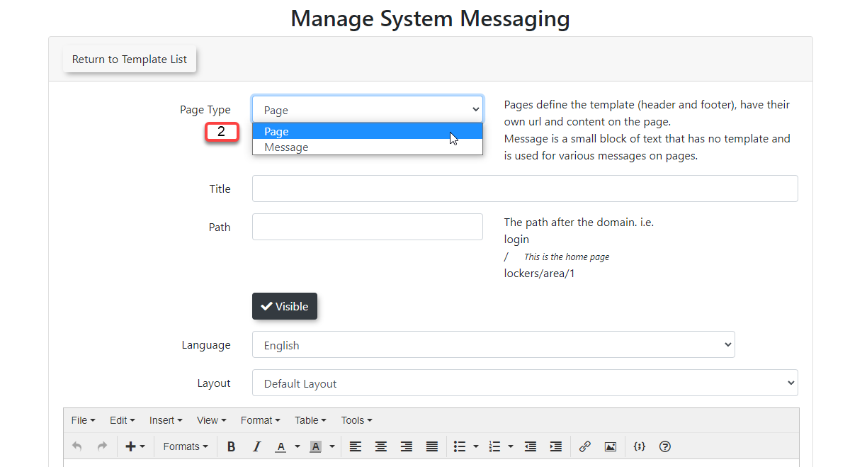
Important: Make sure you select Page under the drop-down menu next to Page Type and not Message. Below we will go into detail on how to create a Page field by field. The images below give you a good visual example of what field is being explained, if there is a certain field you are unsure about you can easily find the picture and read from there.
-
Start by giving your page a Title and specify how you would like the URL at the top of your page to be displayed.

- Adjust the visibility of your page by toggling the Visible button on/off. The Page will still be editable in the System Messaging section but it will not be visible to your users who are on your Page or System Message.
| Toggle On(Visible Page) | Toggled Off(Invisible Page) |
|---|---|
|
|
|


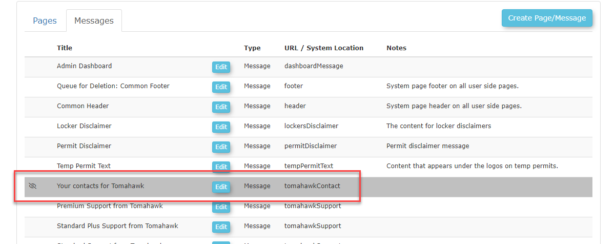
- Toggling the Page as invisible will show it under the Messages tab like seen in the image below to signify it cannot be seen by your users.
- Select the default Language and Layout of your page. If you are not sure which template to use you can leave it as the Default Layout.

- Provide the content of your page in the editor found under the page settings. This content will be the main content of your Pages; you can use Templates & Design to edit the other sections of your pages such as the Header-Content and Footer-Content.
- OPSCOM uses Shortcodes to display a section of interactive or static content like a user login, permits, etc.

Content Placement
Depending on where you place your content it can appear differently. OPSCOM's smart editor reads content top to bottom, left to right. Meaning that placing a user login Shortcode before your content will look dramatically different than if you placed the Shortcode last. You can see a few visual examples of how this works below.
For Example: Shortcodes Before Content
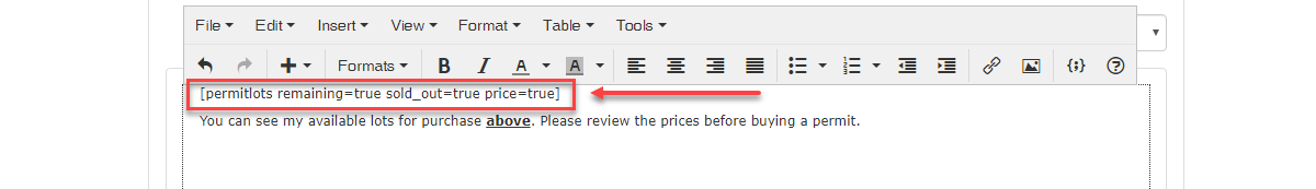
As you can see this displays our lot information before our content.
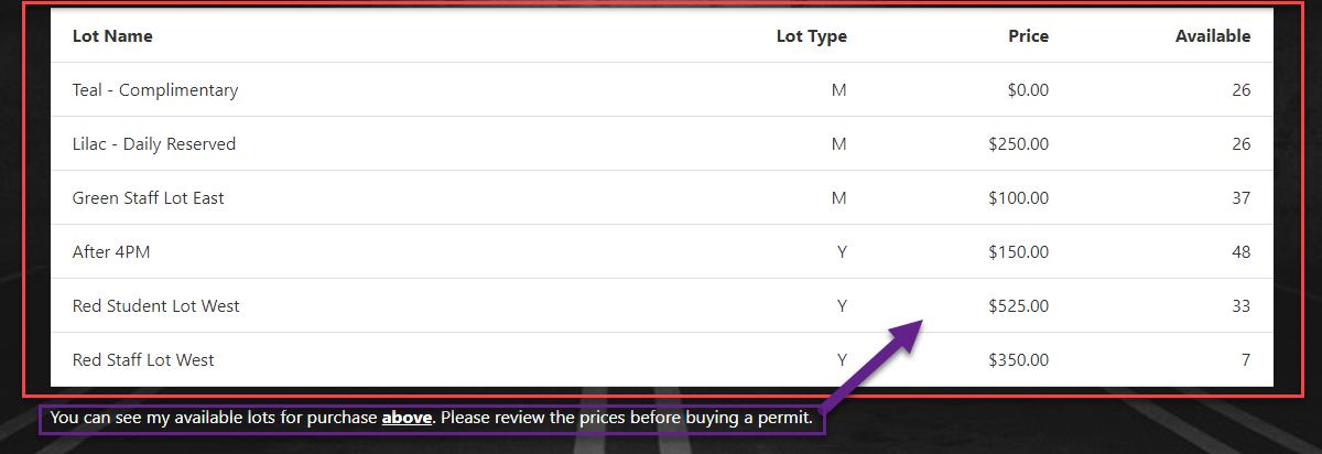
For Example: Shortcodes After Content
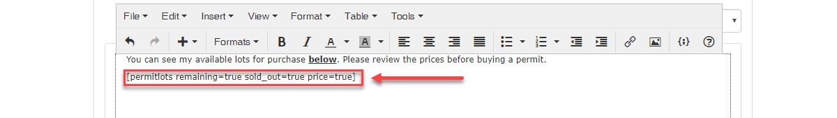
As you can see this placed the Shortcode after the lot information

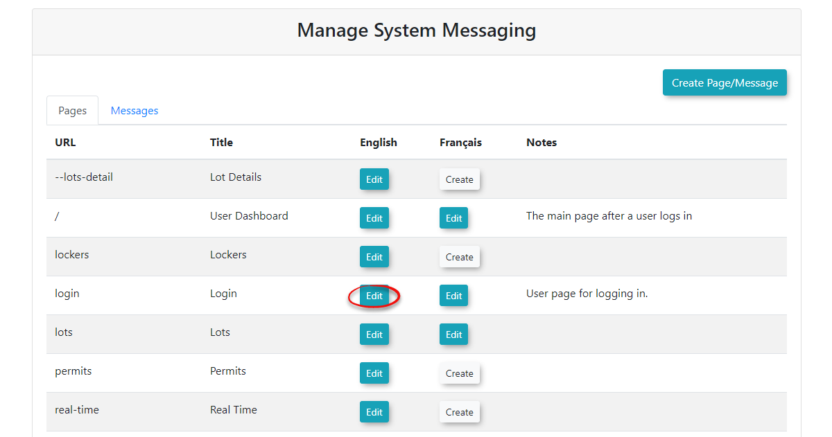
Editing Pages
Keep in mind that the URL / System Location next to the page is the area in OPSCOM that you are updating. Therefore, if you wished to update the permit screen, you want to edit the page with a System Location of /permits.
You can edit your pages attributes such as the Title, Path, Visibility, Language, Layout, and Content after it has already been created.
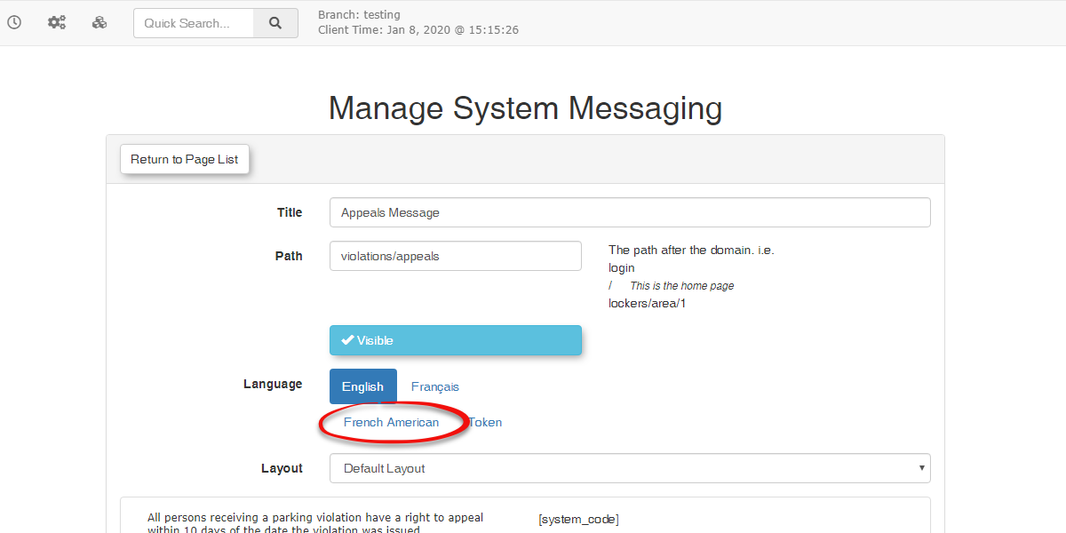
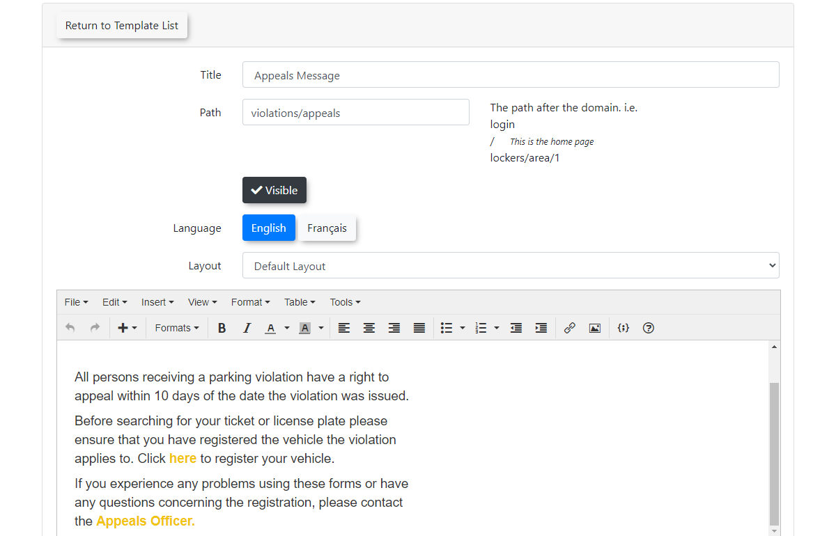
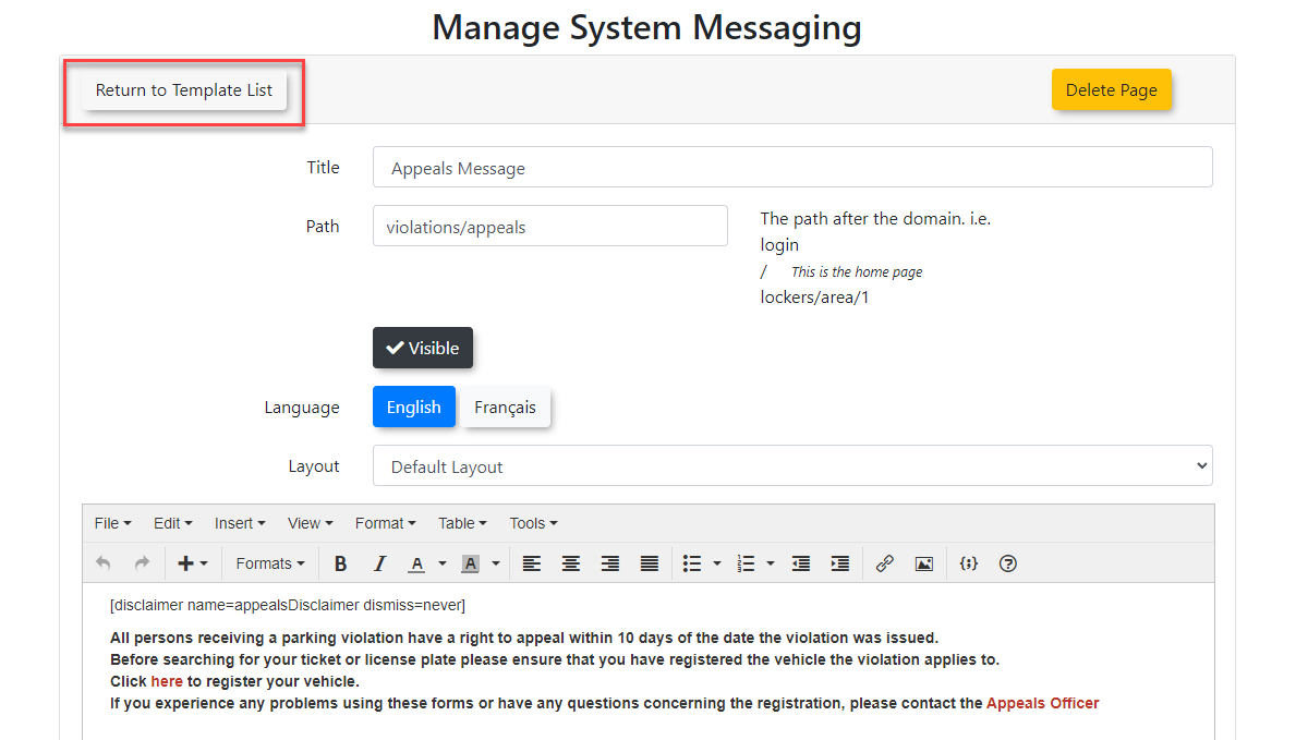
- To Edit a page, simply click on the Edit button next to the page Title you want to edit. As seen in the image below we are going to select and edit the Appeals Message page.

- You can now make any changes to the Pages content or attributes that you like.
See Creating Pages near the top of the page if you are not sure what a specific field does. From here we can edit the format of the text such as the colour, background color, etc..

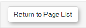
- If you have not made any changes to the page you are Editing, you may go back to the Page List by clicking Return to Page List at the top of the screen. Clicking this button will discard all changes recently made.

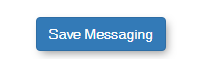
- Once you have finished editing the page, click Save Messaging for your changes to take effect.

Creating System Messages
Important: Users will be brought back to the Users page if users do not agree with a System Message. Meaning, we use System Messaging as a convenient way to offer agreements and disclaimers before users make purchases of permits or lockers.
System Messages and How they work with Pages
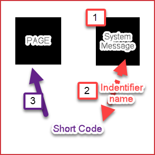
System Messages and Pages work together using Disclaimer Shortcode's. When you create a System Message, you give that message a unique Identifier. System message identifiers may be used in junction with Disclaimer Shortcodes to display your System Messages onto Pages. The idea may be daunting at first, but once you get a better understanding of how these features work together, it will make more sense.
Visual Example
System Messages provide you with a convenient way to add alert messages to your pages that pop-up when a user clicks the page. You may create System Messages to be displayed on specific Pages using Disclaimer Shortcode's.
| Message Attributes | Description |
|---|---|
| Title | The title that will be displayed across the top of the System Message when users navigate to that page. |
| Identifier | The identifier is used to know which page you want to display the message by using Shortcodes. |
| Visibility | This section toggles the visibility of your page which will make it so your users may not see the page, but you can still edit it. |
| Language | Select between two language options for a specific page. Tomahawk current supports English and French. |
| Content | Content is what will display on the actual page. You may use Shortcodes here to view predefined static or interactive content. For example, a user login form could be displayed on your homepage. |
- To create a System Message merely click the Create Page / Message button on the top right of the Manage System Messaging screen.

- Make sure to select the Page Type from the drop-down menu and change this to Message. It is essential that you do not select Page when creating a System Message.


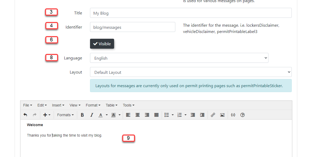
- Create a Title for the message.
- Give the message a unique Identifier so it can be accessed on your Pages using Disclaimer Shortcodes. Shortcodes are codes used to link our Pages and System Messages together.
- Once an Identifier is created, It is essential to note that you may not use it anymore or you will get an error message.
-
You may modify the visibility of your System Message by toggling the Visible button on or off.
Toggle On(Visible) Toggled Off(Invisible) 

- Toggling a System Message as invisible ensures your users won't see it. Although, you can still edit and view the System Message on the admin side, but it will be displayed as seen in the image below.

- Select which Language you would like your content to be in. OPSCOM currently supports two languages which are English and French.
- Edit the contents of your System Message in the editor found below the messages fields. This is the content that your users will see and will allow you to edit and format the way the text looks.
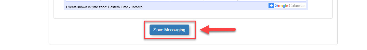
Once finished, click Save Messaging.

Warning: Clicking Return to Template List before Save Messaging will discard all the changes you just made, meaning that the System Message will not get created or your changes will not occur.
Editing System Messages
You can manage your System Messages Title, Identifier, Visibility, Language, as well as modify the content to include text, images, or Shortcodes.
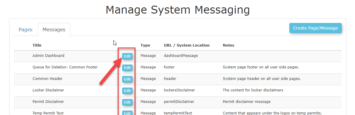
- To Edit your System Messages click the Messages tab under the Manage System Messaging page.
- Select the Edit button next to the System Message you wish to edit. For this example, we will be editing the Admin Dashboard.

-
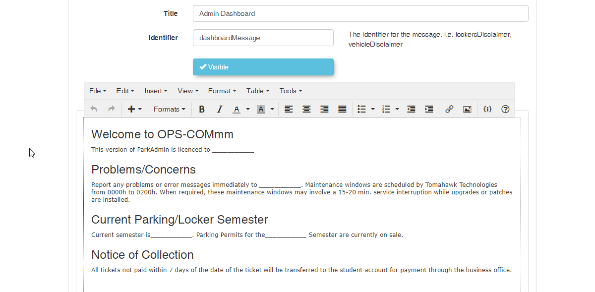
You will now be able to adjust the message your users will see using the System Messaging editor. Below are the fields in which you can use to edit the System Message.
Message Attributes Description Title The title that will be displayed across the top of the System Message when users navigate to that page. Identifier The identifier is used to know which page you want to display the message by using Shortcodes. Visibility This section toggles the visibility of your page which will make it so your users may not see the page, but you can still edit it. Language Select between two language options for a specific page. OPSCOM currently supports English and French. Content Content is what will display on the actual page. You may use Shortcodes here to view predefined static or interactive content. For example, a user login form could be displayed on your homepage. 
- You may use the Title field to change the Title of the System Message.
- You may use the Identifier field to change text used to display a System Message to a Page, but this will require you to modify all Disclaimer Shortcodes using the old unique Identifier for the message you are replacing.
-
You may click Save Messaging when you are finished making your changes.
Add System Messages to Pages using Shortcodes
Now that you know how to create your Pages and System Messages you can bring them together using a Disclaimer Shortcode. A Shortcode is a small body of code surrounded by [ ] used to display complex templates or features. Shortcodes limit the technicality of our system by offering a convenient way to add interactive content without having to know how to script or code.
Please review the Shortcodes for Use on the User Portal for a detailed description of how shortcodes work. You can also find a list of Shortcodes currently available to you by going to the OPSCOM Shortcode Documentation.
Templates and Design
Overview
The User Portal system allows your clients to register, add vehicles, purchase permits and pay violations. It is an important extension of your business, and it should reflect your corporate branding.
Pages and Templates
The OPSCOM user Page will store the functionality and content of your main page, while the Templates will be used to change the functionality of your pages as well as the content around the Page.
Where to Find Templates and Design
Click System Configuration, Templates & Design to access these features.

All Default Templates
If at any point you feel that you have adjusted the Default <scripts> and <styles> to the point of breaking your site, or you are simply unsure what your changes have done, you can refer to these templates to restore your pages functionality and style.
Understanding Templates & Design
Templates & Designs are the visual functionality of your web page structured around your Page content. OPSCOM provides you with default templates which allow you to get started easily without having to know any code.
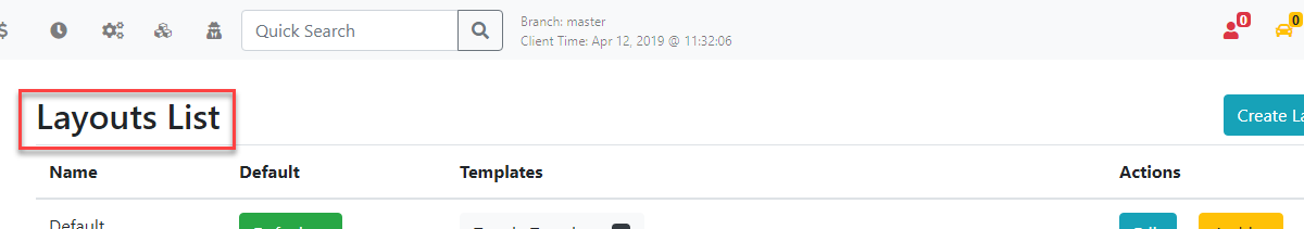
- Once you are on the landing page for Templates & Design, you can view a list of your current templates, or create a new one. Templates contain all of the sections found on your User Portal except for the Page content found in the middle of the page. To adjust this you will have to leave Templates & Design and navigate to System Messaging.
- OPSCOM gives you a total of 12 section templates, 6 in English and 6 in French. (Of course, you will have to create the French content yourself as we do not provide a translator).
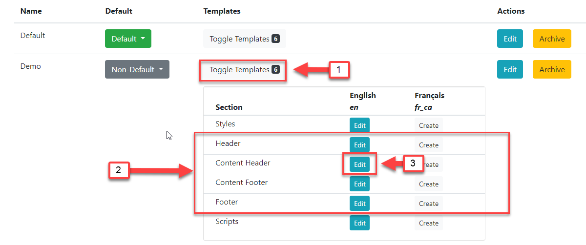
- Clicking on Toggle Templates will display all of the sections attached to that template. Templates can be created in English and French.
- The contents of our pages are split into four separate sections. Header(1), Content Header(2), Content Footer(4), and Footer(5). See Template Layout right below this guide to get a better understanding of the OPSCOM layout.
- To edit a template Section, simply click Edit next to the section name.
Template Layout
Below is a visual example of how your Pages are split into Sections using Templates. All of the Content (3) of our Pages are added through the System Messages under Pages.
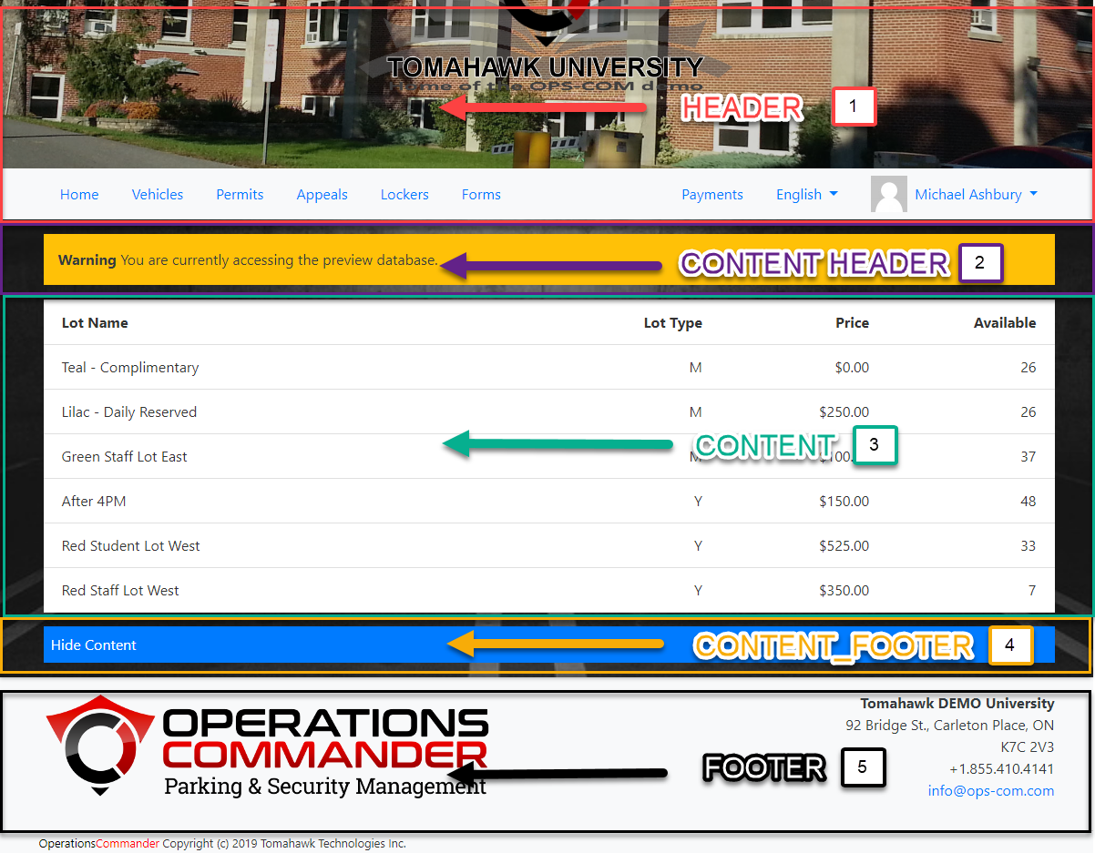
- Header - The header of your page, where you can find your header image and user navigation.
- Content_Header - Another header section for you to place content into, such as alerts or user information. Everything placed here will appear before the Content and Content Footer.
- Content - The content of your pages. Content may not be added from Templates & Design and will require you to navigate to System Messaging.
- Content_Footer - The footer of your Content. Everything placed here will appear after the Content Header and Content. Again, you can use this to display alerts, messages, or additional content to your Template.
- Footer - The footer of your page is where you can find useful information. You can use this area to advertise important information your users might need while using your system.
Page Layouts and Templates
Creating Layouts
To create a layout simply click the Create Layout button found at the top right of the Layouts page.
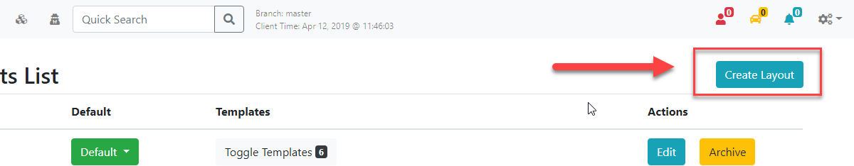
You will be presented with the Add Layout system message.
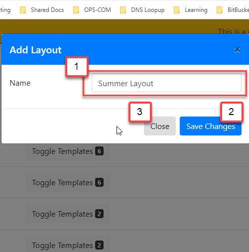
- Provide the name of your layout. In this example, we are going to create our own Summer Layout to be used, instead of the default layout.
- Click Save Changes when you are happy with the name of your layout. Once the Layout has been created, you can see it under the Layouts list.
- If you wish to cancel the creation of your layout simply click Close.
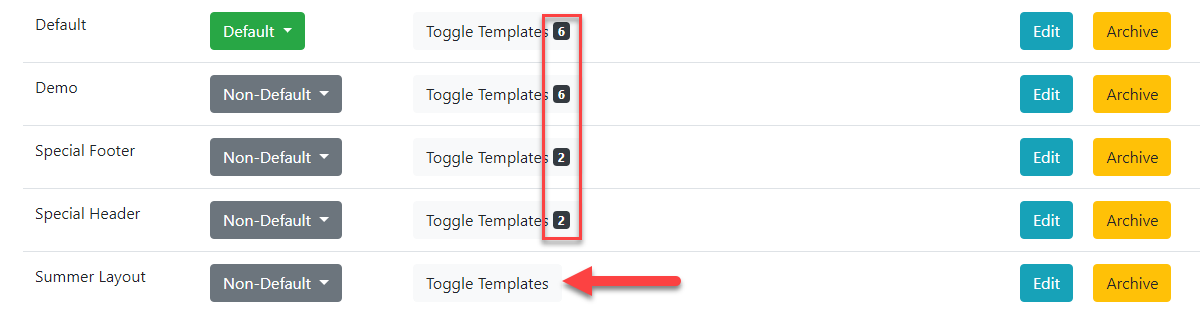
- You can see that our Summer Layout was added to the end of our Layouts List with no sections yet.
- You can choose whether or not your template is the Default template at any time by clicking the Non-Default drop-down and selecting Default.
- Anytime you add sections to your Templates it will display how many are attached next to Toggle Templates. As you can see, we don't have any Sections created yet so there are no numbers to be displayed, otherwise, clicking on Toggle Templates would show you a list of all the templates currently attached to that Layout.
7. You can edit the layout name by clicking on the Edit button next to archive.
8. If you would like to archive a layout that you are no longer using, you can click the Archive button next to edit.
Creating Templates
Now that you have a better understanding of how Templates work with Layouts we can start creating our own.
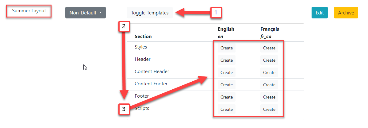
- Click on Toggle Templates.
- Clicking this will display the available Templates attached to the Summer Layout.
- You can now Create a variety of templates for your page, including bilingual support.
- If you are non-technical, it is advised not to change the code for Scripts, Styles, Header, and Footer Templates. You can use the default Style, Script, Header, and Footer Templates from All Default Templates. These can still be edited according to your company and their style guides. See Edit the Page Style and Edit the Page Behaviour below for more information.
Edit the Page Style (CSS)
Important
This guide is used if you intend to adjust the Templates provided to you by OPSCOM. If you choose to rewrite your own Templates you can choose to ignore this.
/* Style properties of our page body, this affects the entire page. */body { background: black url(/uploads/FILES/OC_TOMA/parking-deck.jpg) center center; background-size: cover; background-attachment: fixed; color: #FFF;}/* This changes the color property of --Find where these classes are used .card, .modal, .list-group-item { color: #333;} |
/* Below are all of the styles for our header slideshow at the top of each page. *//*--------------WORD BANK--------------- * ELEMENTS: Elements are the tags with '<>' around them such as <div> and <img> found in the default header and footer template. * We access them here by giving them a Class name or ID. * PROPERTIES: Properties are used to define certain styles to a class or ID. * CLASS: Generally used to assign a style to a group of HTML elements but can be used on single elements as well. * They are assigned within HTML elements like this: <div class="MyClass"></div> where MyClass would be your class name. * ID's: Generally used to assign styles to a single element but can be used on multiple elements as well. * *--------------CLASSES----------------- * * To learn more about the CSS Position Property see: https://www.w3schools.com/cssref/pr_class_position.asp * For more information on CSS Syntax and Selectors see: https://www.w3schools.com/css/css_syntax.asp * It is not recommended to adjust with the position of elements unless you are sure about the changes being made. This can dramatically change how content is positioned. *//* Class Names and Elements * [.slideshow-header]: Container that contains our slides and overlay. * * Properties * @position: Adjust the position of the slideshow-header. For more information see: https://www.w3schools.com/css/css_positioning.asp */ .slideshow-header { position:relative;}/* Class Names and Elements * [.slideshow-header]: Container that contains our slides and overlay. * [.slides]: Controls the style properties of the individual slides. * * Properties * @z-index: Adjust the stack placement of the [.slideshow-header] and [.slides] along the Z axis. * @position: Define the position of the page. * @top:Change in the position from the top of an element. * @left: Change in the position from the left of an element. * @right: Change in the position from the right of an element. * @bottom: Change in the position from the bottom of an element. * @display: Adjusts how the content is displayed on the page. See: https://developer.mozilla.org/en-US/docs/Web/CSS/display and https://www.w3schools.com/css/css_display_visibility.asp * @align-items: Aligns the child elements of this PARENT element to be centered. For a visual example see: https://developer.mozilla.org/en-US/docs/Web/CSS/align-items * @justify-content: Defines how the space disturbed around the child elements. For a visual example see: https://developer.mozilla.org/en-US/docs/Web/CSS/justify-content * * These are the style properties and values of the slideshow header and its individual slides. */.slideshow-header .slides { z-index: 0; position:absolute; top:0px; left:0px; right:0px; bottom:0px; display:flex; align-items: center; justify-content: center;}/* Class Names and Elements * [.slideshow-header]: A container that contains our slides and overlay. * [.overlay]: * * Properties * @z-index: Used to layer elements. Elements with a higher z-index number will appear before elements that are lower. * @position: Set the position property for the element. We recommend you do not adjust this property unless you have knowledge on how the changes will affect your page. * * These are the styles for the overlay, as well as additional properties for the slideshow-header. */ .slideshow-header .overlay { z-index: 1; position:relative;}/*--------------ID'S---------------*//* ID Names and Elements * [#slideshow-header] is the container used to contain the images you have chosen for your header * * Properties * @overflow: * @opacity: * @box-shadow: Create a box shadow for this element. * EX: box-shadow: a, b, c, d(e, f, g, h); */#slideshow-header {} /* ID Names and Elements * [#slideshow-header] is the container used to contain the images you have chosen for your header * * Properties * @width: 100% width will take of 100% of that element. * @position: */#slideshow-header > div { width:100%; position: absolute;} /* ID Names and Elements * [#slideshow-header]: is the container used to contain the images you have chosen for your header. * [div]: Refers to our HTML elements. * [img]: Refers to our images in the slideshow. * * Properties * @width: Defines the width of the images, divs and slideshow-header. A value of 100% will display the image across the entire page. */#slideshow-header div img { width: 100%;} |
Edit the Page Behavior (Scripts)
Disclaimer
Please review the list of supported scripting languages below. If a Javascript vendor is unverified it may break the functionality of your site.
API Integration
Additionally, you can use our API to integrate with pay stations and other devices that will allow you to grab useful information from your users.
Form 11 Shortcodes
Information
When issuing a Form 11, there are a number of shortcodes that can be placed in the template to auto-fill values relating to the violation.
The base short code is formatted like:
- [values show=violation._____]
The blank value must be filled with a value to pull from the violation info.
For each nested value in the data packet, the packet name must be added as part of the variable name, each part separated by a period, with the variable to be output by the shortcode as the final part of the variable.
The packet itself is called by 'violation', and the name must be placed at the start of any value call.
Violation Packet
The violation info packet is formatted like this example.
The values on the left are the variable names, the values on the right are the example values returned by this packet.
{
    "ViolationID": 237,
    "SemPermitID": null,
    "Ticket": "TT-19026",
    "VehicleID": 5,
    "Spoiled": 0,
    "TicketType": 1,
    "Issued": "2024-07-17 16:11:00",
    "convNotice": null,
    "Due": "2024-07-27 16:11:00",
    "ViolationTypeID": -1,
    "Fine": "50.0000",
    "AdjustedFine": "20.0000",
    "Towing": "0.0000",
    "taxAmount": "0.0000",
    "Writer": 7,
    "LocationID": 10,
    "Comment": null,
    "TicketAppeal": null,
    "appealType": 0,
    "appealFormat": null,
    "AccessAdminID": 50,
    "ActionedPer": null,
    "Created": "2024-07-17 20:12:08",
    "AppealUserID": 0,
    "AppealProcessDate": null,
    "AppealAdminID": 0,
    "AppealComment": null,
    "AppealAdminComment": null,
    "AutoNotice": 0,
    "ProcessedByCollection": null,
    "SentToCollections": null,
    "PrivateComments": "",
    "DriveAway": 0,
    "UUID": null,
    "VioNotice": null,
    "latitude": null,
    "longitude": null,
    "Warning": null,
    "userid": null,
    "incidentID": null,
    "failToIdentify": null,
    "pin": "YL",
    "duplicate": null,
    "AdjustmentReason": null,
    "notices_count": 1,

    "user_info": {
            "UserID": 5,
            "studentNo": null,
            "employNo": "00800147",
            "username": "mashbury",
            "firstName": "Michael",
            "preferredname": null,
            "lastName": "Ashbury",
            "street": "688 Zaproxy Ridge",
            "city": "East Romaineburgh",
            "prov": 9,
            "postal": "K2G5B1",
            "email": "mash-bury@tomahawk.ca",
            "display_name": "Michael Ashbury",
            "account_no": "00800147",
            "prov_name": "Ontario",
    },

    "writer": {
            "AdminAccessID": 7,
            "Username": "admin",
            "DisplayName": "Administrator"
    },

    "vehicle": {
            "VehicleID": 5,
            "Active": 1,
            "Plate": "MASH",
            "Year": 1998,
            "TotalVio": 12,
            "TotalUnpaid": 2,
            "TotalWarning": 0,
            "vehicleAlert": true,
            "vin": "JNAMA43H9XGE50339",
            "electric_vehicle": false,

            "province": {
                    "ProvName": "West Virginia",
                    "ProvCode": "WV",
            },

            "make": {
                  "MakeName": "Toyota"
            },

            "colour": {
                  "ColourName": "Black"
            },

            "plate_type": {
                  "TypeName": " Passenger"
            }

            "vehicle_type": {
                  "TypeName": " Van"
            },

    },

    "location": {
            "LocationID": 10,
            "LocationName": "Hospital & Administration Building",
    },

    "details": {
            "ViolationsDetailID": 359,
            "ViolationID": 237,
            "Ticket": "TT-19026",
            "ViolationTypeID": 16,
            "LocationID": 10,
            "offenceFine": 50,
            "discountFlag": 1,
            "discountAmount": 20,
            "discountHours": 240,

            "type": {
                    "ViolationTypeID": 16,
                    "ViolationDescr": "No Parking Snow Route - Mandatory Towing",
                    "DefaultCost": 50,
                    "discountFlag": true,
                    "discountAmount": 20,
                    "discountHours": 240,
            }
    }
}
Examples
An example shortcode is provided for each section. To return a specific value in the same section, replace the provided variable name with the sibling value wanted for output.
| Example Shortcode |
Description |
|
[values show=violation.Ticket] |
Returns the violation ticket number. |
| [values show=violation.user_info.username] | Returns the username of the user the violation belongs to. |
| [values show=violation.writer.DisplayName] | Returns the display name of the admin who assigned the violation to the user. |
| [values show=violation.vehicle.Plate] | Returns the plate of the vehicle the violation was assigned to, if applicable. |
| [values show=violation.vehicle.province.ProvName] | Returns the province or state of the vehicle plate. |
| [values show=violation.vehicle.colour.ColourName] | Returns the colour of the vehicle. |
| [values show=violation.vehicle.plate_type.TypeName] | Returns the plate type of the vehicle. |
| [values show=violation.vehicle.vehicle_type.TypeName] | Returns the type of the vehicle. |
| [values show=violation.vehicle.make.MakeName] | Returns the make of the vehicle. |
| [values show=violation.location.LocationName] | Returns the name of the location the infraction happened. |
| [values show=violation.details.0.Ticket] | Returns the violation ticket number. Alternate value location. |
| [values show=violation.details.0.type.ViolationDescr] | Returns the violation type description. |
User Information Shortcodes
Shortcodes
Shortcodes used to display user information.
Keep in mind that the shortcode descriptions are also on the email template page for lost passwords.
| Shortcode |
Description |
| [user show="firstname"] | The first name of the user account receiving the email or messaging. |
| [user show="lastname"] | The last name of the user account receiving the email or messaging. |
| [user show="email"] | The email address of the user account receiving the email or messaging. |
| [user show="username"] | The username of the user account receiving the email or messaging. |
| [user show="salutation"] | The salutation of the user account receiving the email or messaging. |